A Joke Gone Wonderfully Right
How April Fool's Day Created UnicornForms: A Branding Accident Gone Wonderfully Right When we launched our forms and e-sign platform, we were "LegalDocs Pro," complete with corporate blue branding…
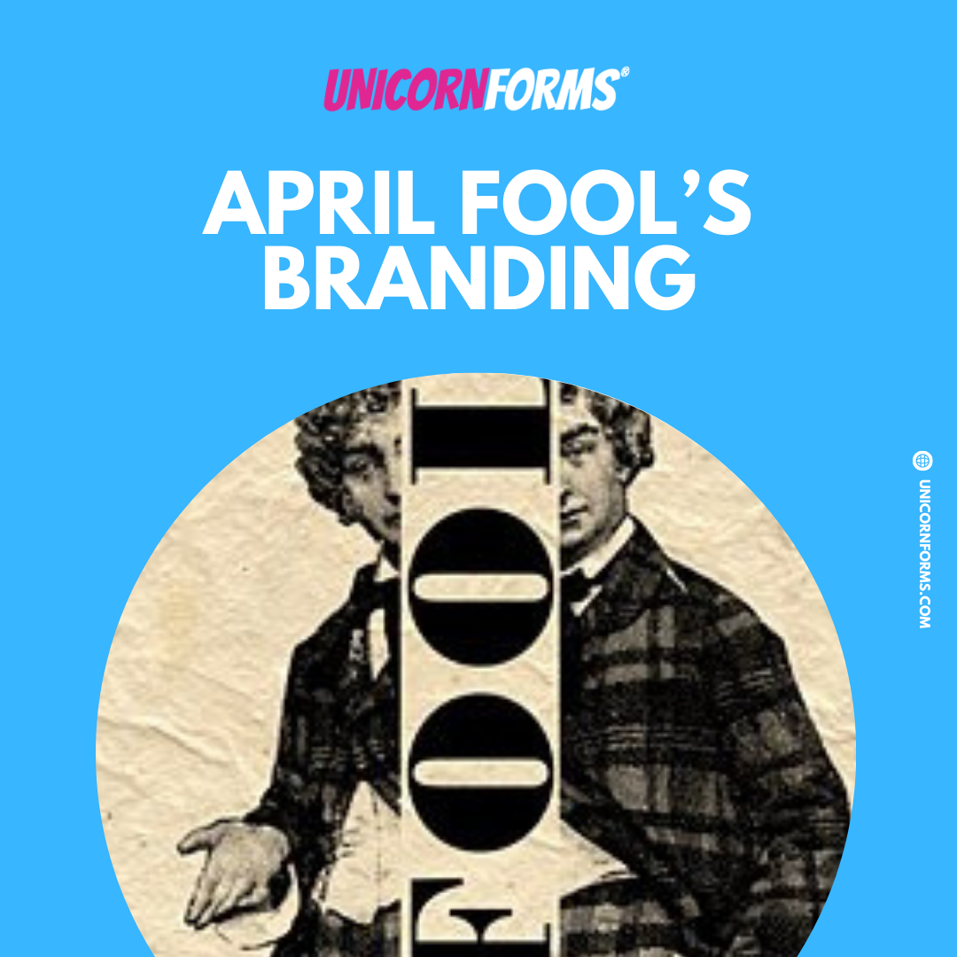
How April Fool's Day Created UnicornForms: A Branding Accident Gone Wonderfully Right
When we launched our forms and e-sign platform, we were "LegalDocs Pro," complete with corporate blue branding and a serious demeanor befitting our target market of law firms seeking a better document editor. Little did we know that a simple April Fool's prank would completely transform our company identity and set us on an entirely different trajectory.
The Prank That Stuck
It started innocently enough. On April 1st, I announced to our team that we were rebranding as "UnicornForms" with hot pink as our signature color, a playful wink at the whole "unicorn startup" phenomenon sweeping through tech. I expected eye-rolls and groans before we returned to business as usual.
Instead, something unexpected happened: everyone absolutely loved it. When I clarified that it was just a joke, I was met with resistance from all sides. Team members, early users, friends, family and even investors all insisted this wasn't a joke. This was our future!
And thus, UnicornForms was born from a prank that has gone "too far". In the best possible way.
Ironic Branding: The Missing Unicorns
As we embraced our new identity, I made a contrarian decision: the first rule of UnicornForms would be that there are no actual unicorns in our visual branding. This was inspired by the subtlety of the FedEx logo with its hidden arrow. If you haven't spotted it, look between the 'E' and 'x'.
But where the FedEx arrow represents straightforward visual wit signifying speed, precision and forward movement, our approach became meta-wit or ironic wit. We'd be UnicornForms without the unicorns. Why?
Because we aren’t the unicorns! Our clients and our users are. We wanted to sing the song of the unsung hero: admins, paralegals, assistants, startup founders and everyone else who keeps the machine of their businesses and teams flowing. They all need and want to be more efficient, so that they can advance in their careers.
And if we can advance the roadmap of a startup by white labeling, e-sign at a cost effective price, isn’t that a good thing for the universe?
In fact, one of our earliest clients got a scholarship to Oxford University using our digital transformation as a case study in their application. Isn’t that amazing?! You don’t hear that as a value proposition from the big players.
Standing Out in a Sea of Sameness
One thing became immediately clear. We stand out!
Whether at Biketoberfest in Houston or across a crowded conference floor, that hot pink and our distinctive font catch attention. People are drawn to our booth just to soak up the vibe, and conversations flow naturally. We've created a space that signals innovation and creativity, attracting exactly the kind of people we want to connect with.
This is the wonderful magic of distinctive messaging: it attracts your ideal audience while gently repelling those who wouldn't be a good fit anyway. People resistant to innovation might be put off by hot pink.
And that's perfectly fine! It saves everyone's time. Meanwhile, those eager to try something different are instantly drawn in. Game recognizes game.
The Power of Suggestion
Here's the fascinating part of our branding experiment: visitors frequently comment on how much they love "all the unicorns" in our brand, despite there not being a single one. The name alone creates such a strong mental association that people see unicorns that aren't there!
This perfectly demonstrates the tremendous power of suggestion that effective branding harnesses. Usually, I don't burst their bubble by pointing out the absence of unicorns. Some people find the irony hilarious when they realize it, while others might be disappointed, so I let them enjoy their perception.
Kafka's Bureaucratic Nightmares
Franz Kafka was perhaps the only writer with a truly bureaucratic imagination, but what he saw there were only nightmares. In "The Trial," his protagonist Josef K. is arrested and prosecuted by a remote authority without ever learning the nature of his crime. He's shuffled from one incomprehensible procedure to another, drowning in paperwork and opaque processes, ultimately meeting his demise without ever understanding what happened.
Kafka saw bureaucracy as a labyrinthine monster that devours human dignity. The endless corridors of meaningless forms, the faceless officials who can't help you, the perpetual feeling of being lost in a system designed to frustrate rather than serve. These were his visions of administrative hell.
At UnicornForms, we imagined something completely different. What if bureaucracy could be more like DoorDash: a streamlined service that delivers exactly what you need, when you need it, with minimal friction? Instead of a confusing maze where someone has "moved your cheese," we envisioned a better way to navigate regulatory compliance, security protocols, and complex workflows.
The Question Remains
So what's the verdict? Should we maintain our distinctive hot pink and unicorn-free UnicornForms identity, or revert to something more conventional for the document, form, and e-sign space?
Given how crowded that market is with forgettable, similar-sounding names, I'm inclined to believe our accidental April Fool's rebrand might be the best business decision we never intentionally made. We're memorable in a sea of sameness, and we're attracting innovators who share our vision.
Sometimes the best brand identities come from embracing the unexpected, even if it started as a joke.